Guide on the features of the Flash Charts
Guide for:


The ShinyStat's graphs and tables allow an immediate and dynamic visualization providing interesting features for a better understanding and analysis of the metrics under examination.
Moving the mouse over the chart, the day and the values of the considered metric will be displayed in a label on the day on which the mouse is placed.
On the right edge of the graphs and tables, there are several features that can be activated or deactivated with a simple click.
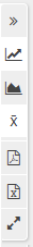
By moving the mouse over each icon, a label explains what the corresponding icon is for.
The available icons offer the segutni functionality:
- Expand / collapse the graph horizontally
- Bar chart
- Line graph
- Area chart
- Show / Hide the moving average
- Export in PDF
- Export to CSV
- Activate / deactivate the full-screen graphic display