Monetary Conversions - Desktop vs Mobile
Guide for:


This report shows the monetary conversions during the selected time interval according to the device used by your visitors.
In particular, the “Desktop vs Mobile” report allows you to compare the trend of monetary conversions by visitors utilising a desktop device to the trend of visits using a mobile device.
The first table provides the following information:
- Number of Monetary conversions: total number of monetary conversions (independently from the device), number of monetary conversions from Desktop Devices and number of monetary conversions from Mobile Devices
- Revenues: total revenues (independently from the device), revenues from Desktop Devices and revenues from Mobile Devices
- Visits: total number of visits (independently from the device), number of visits from Desktop Devices and number of visits from Mobile Devices
- Value
- %: it shows the percent (compared to the total)
Filters
- Calendar: this option allows you to select the time interval for which you want to analyse the traffic data. For more info, click here.
Charts
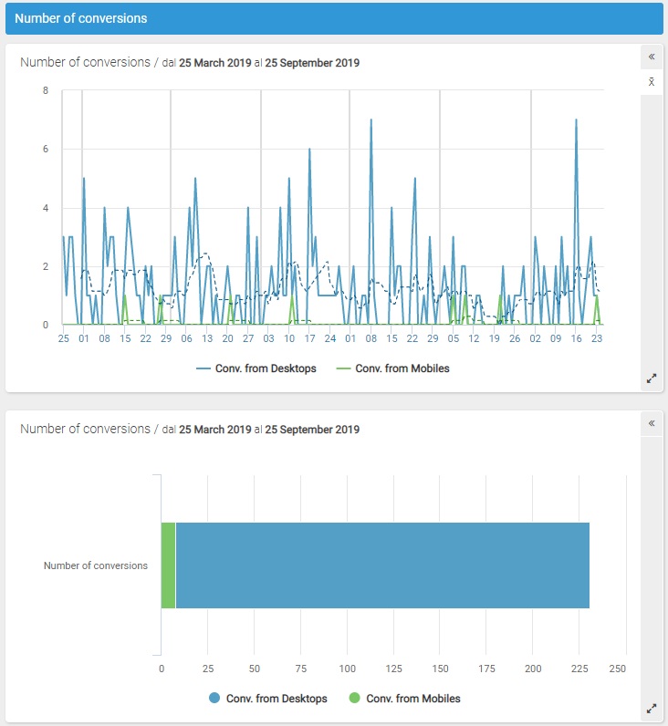
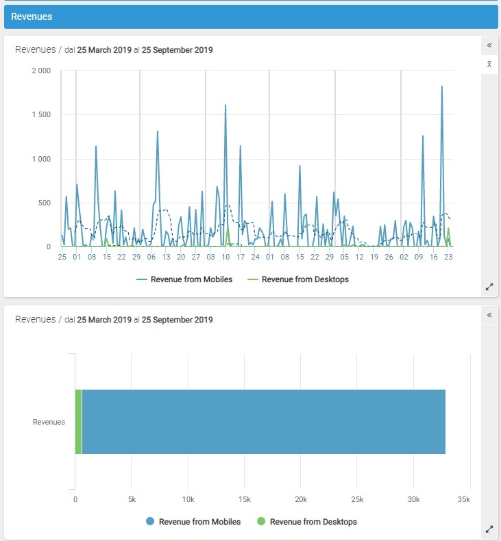
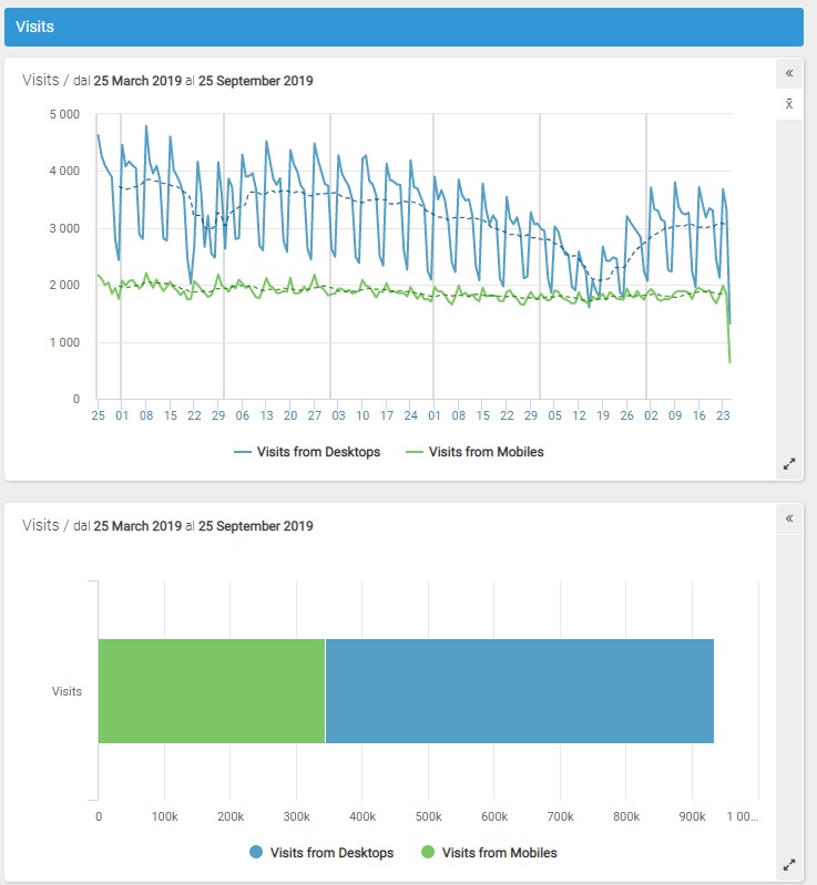
The line graphs and the stacked bar graphs respectively show the trend and composition of monetary conversions, revenues and visits received from desktop compared to those received from mobile.
The line chart shows the trend of the data in the selected period; it shows on the horizontal axis the days or months in which the represented period is divided and on the vertical axis the number of conversions from desktops and the number of conversions form mobile devices (represented with different colors).
By clicking on the "Show / hide the moving average" icon, you can respectively show or hide the moving average which is displayed in the graph with a dotted line for periods that include at least 8 days.
The stacked bar chart shows the composition in absolute values of monetary conversions, revenues and visits depending on the utilised device: desktop or mobile (represented with different colors).
- Revenues
- Visits
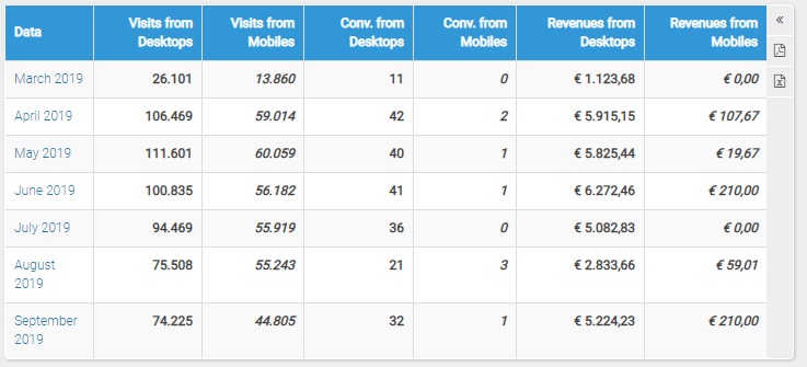
Table
Each line of the table shows the following information:
- Date: it shows the specific day or month in consideration
- Monetary conversions from Desktop Devices: it shows the number of monetary conversions by visitors utilising a desktop device
- Monetary conversions from Mobile Devices: it shows the number of monetary conversions by visitors using a mobile device
- Revenues from Desktop Devices: it shows the revenues by visitors utilising a desktop device
- Revenues from Mobile Devices: it shows the revenues by visitors using a mobile device
- Visits from Desktop Devices: it shows the number of visits by visitors utilising a desktop device
- Visits from Mobile Devices: it shows the number of visits by visitors using a mobile device
N.B.
Please note: data on traffic split by desktop and mobile are available since October 2007.
Data on traffic split by tablet and smartphone are available since February, 12th 2015.